


We’re employee-owned, every team member you work with brings the mindset of a business owner.

Alan Coleman, CEO


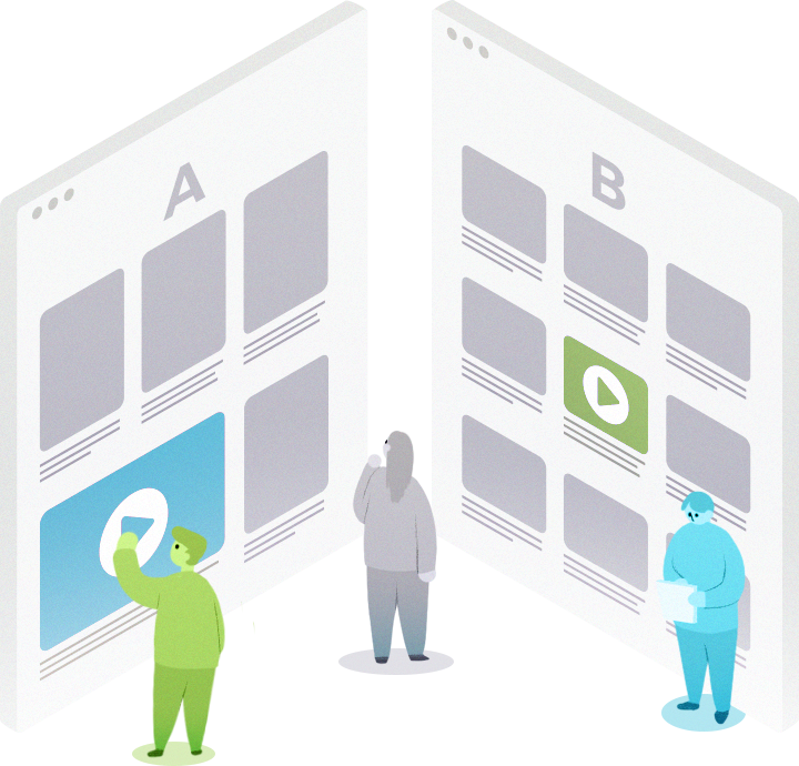
A/B testing is one of the key practices of conversion rate optimisation, allowing you to test variations of your landing pages to see what resonates best with your customers. In the competitive inbound marketing environment, it’s imperative that you stand out from your competitors and keep on generating leads.
Trying to determine what to include on your page to attract and convert strangers into potential customers can be overwhelming at times. Organisations often miss lead generating opportunities by forgetting to run a split test on their pages. So, if you need some A/B test ideas, this article could be just what you need.
Before I get into the elements of what to test, let’s take a look at what exactly a landing page is and how it’s different from your other website pages; particularly your homepage.
A landing page is a standalone web page, created specifically for the purposes of a marketing or advertising campaign. Unlike a typical homepage, landing pages have just one purpose - to focus the user on one single action.
For example, the mission of a given landing page might be to get a user to;
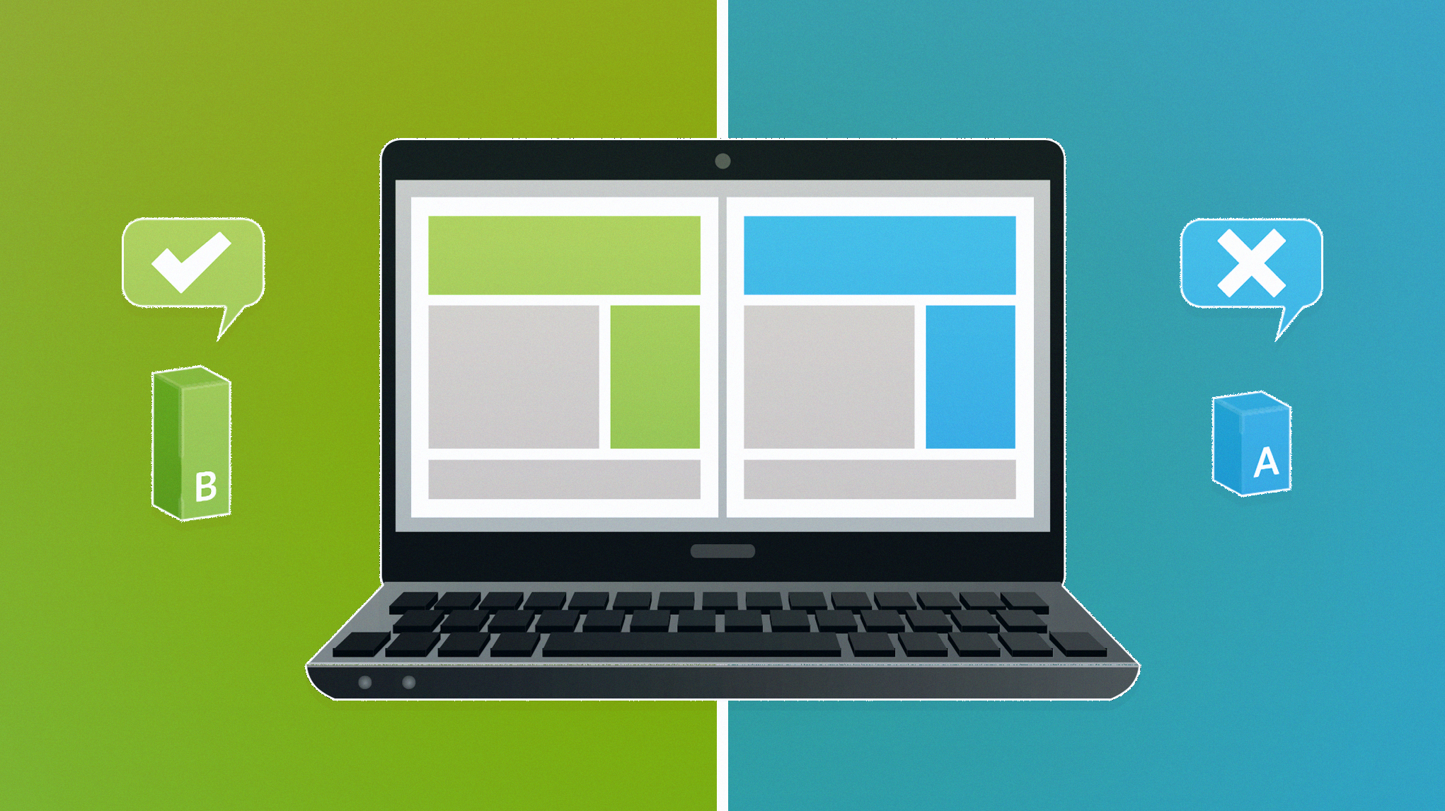
A/B testing is a method of systematically improving the performance of your landing pages over time, by testing various components in a structured way.
It’s a method of comparing two versions of a page against each other to determine which one performs better.
Running experiments on landing pages is one of the first places you can focus your “let’s test it” attitude. Landing pages can be tweaked with very little effort and often produce a big lift in terms of conversion results.
There are numerous tools available to easily run A/B testing on your landing pages without having to go to your development team. A/B testing is a sure way to get to the bottom of a decision without relying on anyone’s gut instinct. Below are the top five elements we recommend testing that have the biggest impact on conversions.
The call-to-action button (or CTA) should be the most obvious item on your page. It should stand out against the rest of the page and it should scream to the visitor ‘Click Me!’. Finding the right colour, placement and message for your customers is key for driving conversions.
We recommend running tests on button colour, button labels and the position of the button on your landing page. The text on the button can have a huge impact on conversions. Text that is personalised to the visitor and their needs usually performs better. We’ve statistically seen buttons labelled ‘Download My Checklist’, outperform buttons labelled ‘Download the Checklist’
You can also A/B test the position for the CTA button on your page. You’d be surprised how moving a CTA button around on the site can produce dramatically better results. It’s important to consider mobile and desktop versions to ensure the CTA is prominent on both. The last thing you want is for your visitors to have to search for the CTA.
For mobile sites we’ve produced great results by adding a sticky CTA that persists as the visitor scrolls down the page. With Pinergy, one of our lead generation clients, we increased mobile conversions by 15% YOY with the addition of a sticky mobile CTA.
When a prospective customer visits your landing page, you have less than 10 seconds to get their attention. You have to emotionally connect with them quickly and persuade them to take action. This is a significant task, and that’s why messaging and page copy are so important. Testing different headlines and measuring how compelling they are to visitors is a great way to see which messages work with your target customers and which messages are ignored.
Your headline should speak to your user’s pain points. What keeps them lying awake at night? What solutions do you have to solve that problem? The headline should grab the user’s attention, and resonate with a particular issue they’re having. It tells them, “Yes, you’re in the right place and here’s what you can expect.” Only 20% of people who scan your headline will continue reading your content.
For your landing page to convert, your headline needs to promise a very specific result, and a USP (Unique Selling Proposition) that sets you apart from your competitors. The best headlines create a need for the user, while also conveying a sense of urgency and uniqueness of your product. We strongly suggest testing landing page variants with different headlines, and measuring their impact on conversions.
It’s often demonstrated that the fewer the number of fields in a form, the higher the number of conversions. HubSpot recently researched the contact forms of 40,000 of their customers and found that conversion rate improves by almost half when the number of form fields are reduced from four fields to three.
Avoid asking for age, address or telephone number, since those tend to turn people off the most. However, there is a balance to what the right form length should be for your prospective customers, and ensuring you are asking them the right questions. As usual with digital marketing, nothing can ever be straightforward. Some case studies have revealed that long(ish) forms can also have a high conversion rate. A good example is Salesforce, their form has 10 custom fields and one tick box; conversions increased when they lengthened the number of inputs in their contact form.
Running tests on the number of questions, and the types of questions to get quality leads is essential for increasing form conversion rates.
The position of your forms can also have a big impact on conversions. One successful test that ran on the Windward Software ‘free trial download’ landing page, tested the position of the form on the right side against the left side. Internal management were initially sceptical that moving the form would make an impact on conversion rate.
With test results in, the submission form on the left side of the page created an incredible 30.8% lift in form submission rate! Results achieving 95% confidence. The results were so compelling that all marketing divisions now support a“test everything” mentality as much as his testing team.
Testimonials and expertise are essential for earning trust with prospective customers. When it comes to the issue of building confidence, trust signals can help put prospects at ease. Customer endorsements help reiterate what makes your product great and who it is for, and provide external validation. They work even better when they focus on measurable results. For instance, “Wolfgang Digital increased my conversions by 50%.”
Testimonials should be relevant to the user group you are marketing to. Choose testimonials that are as precise as possible about the problem they faced and how the product helped, using precise numbers when possible. When potential purchasers see that other consumers just like them have received the promised value of your product, it puts them at ease and removes a substantial emotional barrier to purchasing.
Company logos and trust emblems can also help build confidence. When Blue Fountain Media added Verisign Logo on their landing page they increased their conversion rate by 42% and signup form entries by 81%.
Since there are many different types of trust signals, it’s important to test which one will prompt your leads to convert on your site. Depending on the test results, you might as well have more than one type on your site.
When it comes to the images featured at the top of your landing page, there are always a few surprises to what resonates to customers the most. For starters, it seems like most SaaS companies are still choosing to show off their software at the top of the page (40%), rather than a photograph of people (27%) or an illustration (8%). Besides painting a pretty picture on your website, using images on a site will help attract thousands of people to your site. Studies have shown that any web pages that have images get 94% more views than pages without. Imagery is one of the easiest things to test, but one of the more difficult to anticipate results. Highrise Marketing Suite found a 102% increase in sign-ups when they added photos of real people to their landing pages.
Overtly looking stock imagery can have a negative impact on trust. We recommend testing different types of imagery featuring real-looking people, or of your company. Test, test, test to see what works best!
Developing a testing mentality within your company is like learning a new skill. It will take time, practice and discipline. Eventually, testing will become second nature and you’ll more naturally create tests, execute tests and evaluate test results as a regular part of your digital marketing activities.
We highly recommend that you implement the different ideas in this blog post through A/B testing. Our CRO (Conversion Rate Optimisation) Department can help you devise and run monthly tests as part of a prescriptive conversion optimisation plan.
Get in touch with our CRO team to discuss how an A/B testing plan can boost conversion rates.


Partner with a 6x Best Global Agency Winner that's as invested in your growth as you are.


