


We’re employee-owned, every team member you work with brings the mindset of a business owner.

Alan Coleman, CEO


Wolfgang Digital is an equal opportunity employer committed to fostering an inclusive workplace


Wolfgang Digital is an equal opportunity employer committed to fostering an inclusive workplace

If you run an online retail store, ecommerce conversion rate is the most important metric you’ll need to watch. Conversions don’t just happen - you need to optimise for them.
In an increasingly competitive digital buying world, there are some do’s and don’ts when it comes to encouraging customers to buy items from your business. Each of the improvements detailed below will help make incremental improvements to your overall shopping experience, and therefore an increase in your conversion rate.
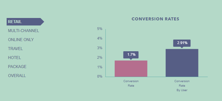
With Wolfgang retail clients, the average conversion rate is coming in at 1.7%. As conversion rate is measured by the number of sessions, and not the number of users, we also look at the conversion rate by user, which comes in a 2.91%. The more times you can entice a user back to your site, the higher your chance of converting them.
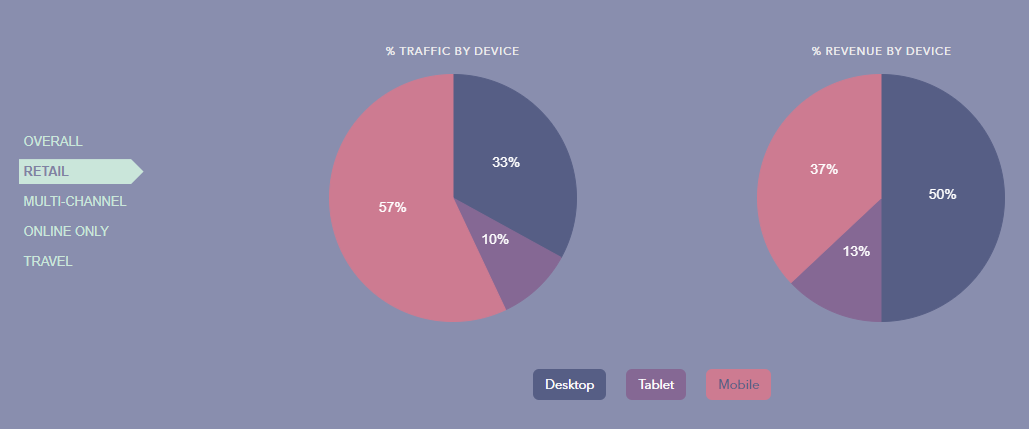
People are finally pressing purchase on their mobile phones. Revenue on mobile devices has been the big mover - growing by 23%. It now accounts for 32% of revenue and 53% of traffic. For Wolfgang retail clients, 57% of the traffic is coming from mobile devices, but this only allows for 37% of revenue.
With the higher amount of traffic coming from mobile devices, there is a great opportunity to improve the mobile experience and increase mobile revenue.
As users expect a seamless mobile shopping experiences, the popularity and growth of mobile ecommerce is happening even faster than previously anticipated. Mobile-based research, shopping and payments are now easier and more reliable than ever. Currently 20% of Irish consumers shop online at least once a week via their mobile devices, and this is only set to grow when mobile experiences are improved.
Mobile will soon become the prevalent online shopping channel, and mobile friendly websites are now expected as standard.
While loading speed is one of the most important factors for mobile visitors, there are further additions we suggest to make the sales journey more enjoyable. A mobile optimised site makes the conversion process easier and less stressful on the user. Here are some features to consider:
In Wolfgang, our CRO team have reviewed hundreds of ecommerce websites, and see the same issues that limit the mobile experience for users. Below are our top tips to increase conversions along the sales funnel - from the product page all the way through to the final payment.
Product pages are the virtual shop windows to showcase each of your products. With 55% of visitors spending less than 15 seconds on any given webpage (Time.com), it’s imperative that we catch a visitors attention within those first few seconds of the conversion journey.
There’s no question that quality, engaging images are key when it comes to selling products online. And it’s no secret that our brains love visuals and can process them faster to gauge whether a product is suitable for us.
Your images should be high-quality on any screen resolution, they should showcase the product from multiple angles, and also show the product in context. People love to envision themselves wearing or using a product, giving them an idea if it suits them - so be sure to include this type of imagery.
For the small screen sizes on mobile devices, it’s vital to allow user to pinch and zoom product images. We've seen numerous examples of bad user experiences, with users unable to zoom product images on mobile devices. Your imagery should allow your users to see every small detail of the products they’ve chose to engage with.
These days, most people have access to 4G bandwidth, so browsing and viewing videos has become part of their normal mobile experience. Even more engaging than photos, videos can help show visitors how a piece of clothing looks when worn, or tell a story about a product.
Engaging images can go a long way to make your products more enticing, but you’ll need to go further to entice those customers wanting to know more.
Your product description should focus on the unique value proposition as its main benefit - what sets your product apart from its competitors.
As analytics and ecommerce expert Neil Patel puts it, you have to “sell benefits, not features,” which means that you have to emphasise the result, not the product. Buyers are expecting to gain something by purchasing your product, and it’s your duty to convince them that they will.
Your product description should be a combination of a short, easy-to-read summary and a longer product description for more engaged customers. Be sure to make text scannable and digestible.
When putting together your longer product descriptions, you need to add as many details and specifications as possible, so that no questions go unanswered. Never copy the descriptions from product manufacturers (this damages your SEO). Your product descriptions should be written with a personal touch that speaks directly to your customers - this will improve your search visibility.
Customer endorsements help reiterate what makes your product special, and what other people think of the product. Testimonials work really well in providing external validation to customers.
Social proof can take many different forms - reviews, ratings, customer testimonials, videos - it doesn't matter which as long as it’s relevant to your audience.
Classic star ratings or reviews are always a good place to start. Ensure to include real reviews by real customers. Buyers are savvy to spotting fake reviews on websites that have lots of five star ratings. Having one or two bad reviews can actually increase conversions, providing that the overall rating is high.
Every step from your product page through to your cart should have one clear CTA. It should be the most prominent thing on the page and should:
A Commerce Cloud study indicates a 3.5% lift in conversions when the checkout buttons are placed above the fold. Users should never have to scroll and search how to add products to their cart, so making this CTA visible and enticing is essential to nudging visitors into the conversion funnel.
Cart abandonment can be as high at 70%, so the basket stage is the most common drop off point for customers in the conversion funnel.
Just before your visitors proceed to checkout, they’ll land on your basket page. This page has one sole mission: to lead your visitors to actually pay. For most buyers, the basket or cart page is used to review their order. Below are a few tips to ensure we move the customer along the checkout funnel.
To discourage users from dropping off at this stage, your mission is to clearly display all the relevant information regarding the product, so they don’t need to go back and check on any details. Don’t forget to include:
Having all these elements clearly provided to your customers will help them quickly review their order before they purchase: this will decrease the percentage of people abandoning their cart because of unclear information.
Customers are easily distracted during the checkout process, so removing any additional links that take them out of the funnel is best practice. We recommend removing the header and footer on checkout pages to remove any distractions. As mentioned before, the “proceed to checkout” CTA should be the most prominent item on the page, moving the customer along one clear path.
84% of online shoppers are comparison shoppers, shopping online with different tabs open, to find similar products and compare prices before making a final selection. This back and forth means they’ll often close out of windows, and move on, sometimes not coming back for days before making a decision to purchase. We also know consumers shop and browse from multiple devices.
For this reason, it is crucial that shopping carts are saved for those users who come back to your site. Persistent shopping carts support these shopping behaviors by allowing customers to pick up where they left off when they return to the site.
Once the customer has reviewed their basket the next step is to proceed to checkout. The quicker the checkout process and the less tasks involved, the less chance you have of losing customers along the way. The most effective ways to improve the checkout are to reduce the steps and simplify the process.
Landing into a cart and seeing that there are six steps to complete is enough to make most customers run away. If your store checkout process is too long, complicated or unconventional, you may lose a lot of customers right as they are ready to buy.
Ask only for information that is necessary for the sale to be completed, and offer the use of “same as billing address” to auto-fill the shipping address. One of the best ways to reduce shopping cart abandonment is to eliminate unnecessary pages and streamline the process, ideally shortening your checkout process to a single page. One-step checkouts are becoming more and more popular and they are an excellent tool for converting mobile users.
Some customers prefer not to create accounts for each ecommerce site they purchase from – they don’t have the time, or they just don’t want to share that much information about themselves. Because it turns off a lot of potential customers, causing some shoppers to decide not to continue, a mandatory sign-up policy should be removed.
It’s not a good idea to require customers to create an account prior to checkout. Not only does this slow down the process, a lot of customers will actually bounce.
Over 48% of online retailers also said a guest checkout was the most important factor to increasing shopping cart conversion rates on their websites
By letting visitors use the checkout as guests, you streamline the checkout process. You can always ask them to sign up for an account at the end, after they’ve made their purchase.
Having different payment options is a necessity in today’s ultra-competitive ecommerce environment. Not only will this help you gain more conversions, but it will also reassure visitors that are used to a particular payment solution.It is estimated that 50% of regular shoppers would cancel their purchase if their favourite payment method wasn’t available.
Payment options such as Paypal, Apple Pay, Android Pay, Amazon Pay, and Visa Wallet are becoming increasingly popular and provide extra security for shoppers - ultimately helping to increase conversions.The particular payment options your customers prefer will vary, so it’s important to know your buyer persona.
On mobile, alternative payment options are especially beneficial where, according to PayPal, mobile sites can see as much as a 44% increase in conversion with Paypal.
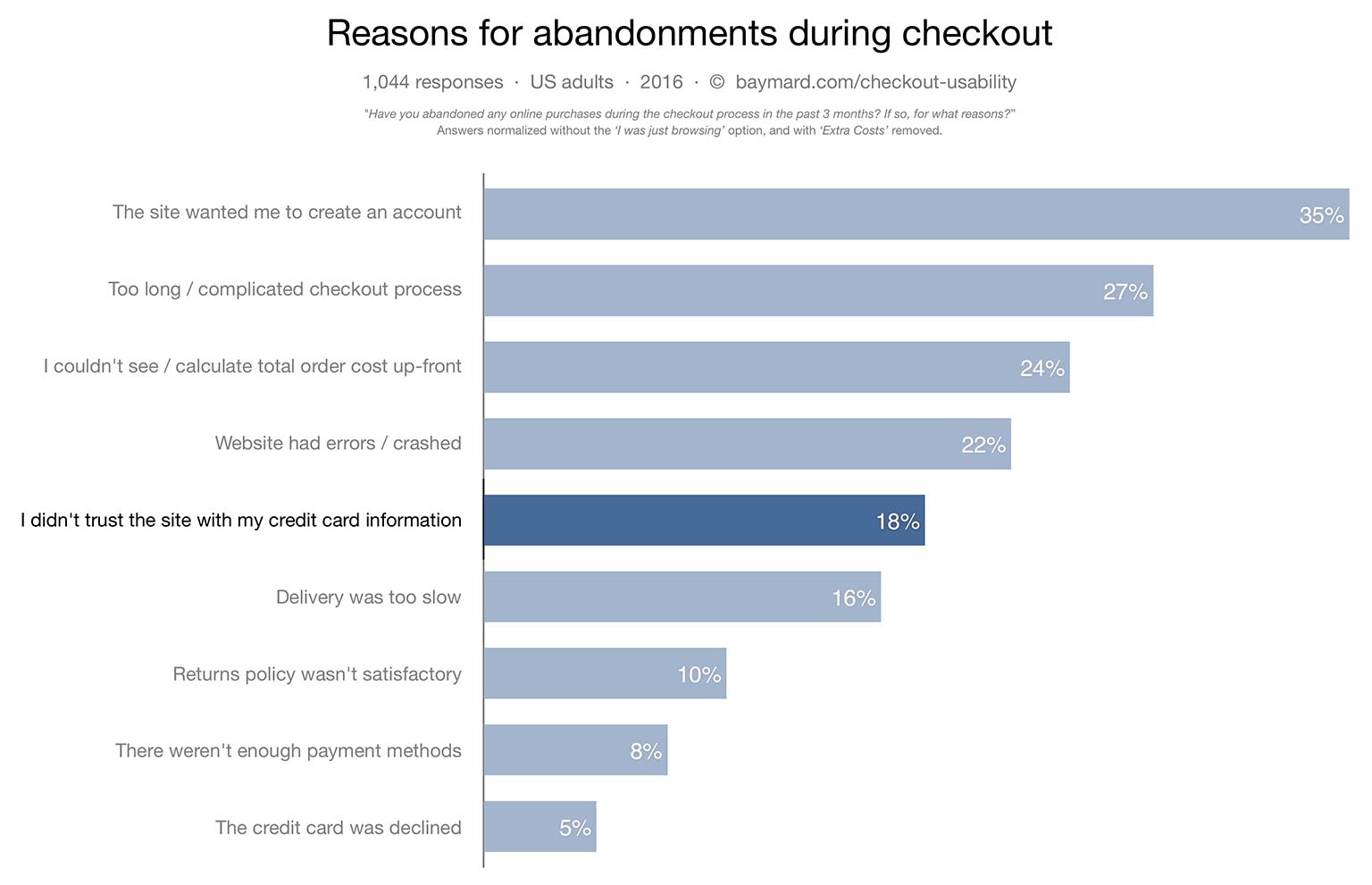
It’s estimated that 18% of shoppers don’t purchase because they are concerned about security according to Baymard Institute. Trust seals and Reassurement can help give users that extra push to press that ‘Pay Now’ button.
Including security badges on your checkout is proven method to help instill confidence, and reduce cart abandonment. It’s also important to reassure shoppers that their personal information is protected. Even the largest, most-trusted brands can benefit from labeling buttons with the words “secure checkout”.
In addition to security badges, you can boost consumer confidence with risk-free shopping messaging, such as “best price guarantee” or “free returns”.
There are several things you can tell users if you want them to move along the conversion funnel. These include letting users know their payments and personal information is secure, that there is free cancellation, free returns, best price guarantee, and so on.
A Forrester study shows that 44% of online shoppers abandon their carts because of shipping and handling costs. While this is only a few euros in many situations, the cost of shipping is enough to win or lose a sale.
By offering free shipping, you will not only help prevent cart abandonment but will even help gain more sales. If you are unable to offset shipping costs, it’s best practice to have one standard shipping rate, upfront and visible from the basket, so that users aren’t discouraged by the additional cost at the end of the process.
Ideally you’d test every element of your ecommerce store, including our suggestions above. We recommend A/B testing every change to your ecommerce platform to see which had the greatest lift in conversion, and how they can be improved upon by tweaking further.
With the tips in hand, you have at your disposal a checklist to make your online store more focused on converting mobile and desktop customers, and set you ahead of your competitors.
By using informed product pages, high-value descriptions, product images, intuitive baskets and a checkout process that’s a breeze - you’ll have an ecommerce site that's designed for maximum conversions. Here at Wolfgang we don’t just optimise for individual click and conversion rates, we analyse the entirety of your website so that every visitor, at every stage in the buyer journey, has a seamless user experience and an intuitive conversion path to follow. Contact our CRO team if you’d like to discuss how to increase conversions on your online store.


Partner with a 6x Best Global Agency Winner that's as invested in your growth as you are.


